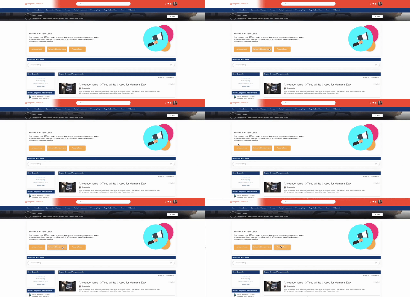
With Hero, you can configure a larger-sized banner to display an image (with shapes behind it if wanted), general text, a title, and three call-to-actions. This is a great way to inform users why they may be on a certain page and provide them with important links within a space. This is helpful if you have a landing page and need to provide users with a blurb on why they are in a certain space as well as the quick links they would most likely need in that space.
Key Features:
- Can display up to three different calls-to-actions
- Can display general text in addition to calls-to-action buttons
- Images and shapes can be either bubble or square-shaped
- Can use any hex colors
Updates Made to Hero:
- The updated Hero now supports:
- Control over the roundness of all call-to-actions (CTAs)
- Larger font sizes for all font types (title, paragraph, etc)
- Size control over the image as well as shapes

Hero with Squares
This is a configuration showing how you can choose to have squares behind your image; they are configurable to be whatever color you would like.

Hero with Circles
Instead of having squares, there is a configuration option to have circles behind the image; just as the squares the circles are configurable to any color you would like.

Hero with Two Call-to-Actions
This shows an example with two call-to-actions instead of one.

Hero with One Call-to-Action
This shows an example with two call-to-actions instead of one.

Hero with No Call-to-Actions & No Shape Roundness
This shows an example of a configuration with no call-to-actions and the shape roundness is configured to none.

Hero with Small Shape & Image Roundness
This shows an example of a configuration with a small shape and image roundness.

Hero with Medium Shape & Image Roundness
This shows an example of a configuration with medium shape and image roundness.

Hero with Large Shape & Image Roundness
This shows an example of a configuration with large shape roundness and large image roundness.

Mobile View
When in mobile view it will not display the shapes; instead it will display the image followed by the hero title and description. Underneath that will be the call-to-actions listed vertically.

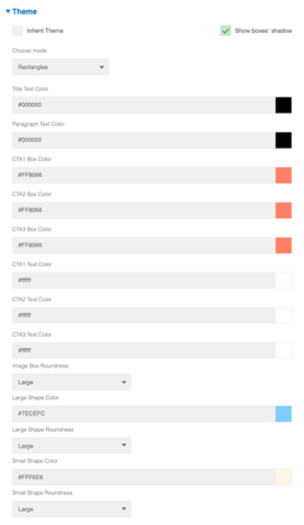
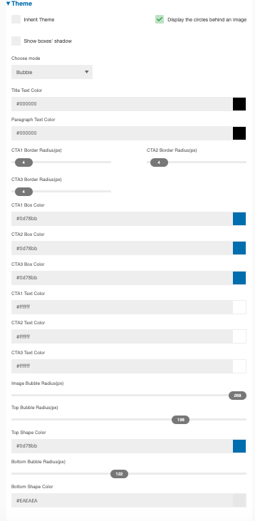
Configuration of Hero by SE
| Original Configuration | Updated Configuration |
 |
 |
Price: Free